
Last time we talked about how data visualizations can be used to get a better understanding of the Alberta Energy system. Now we are happy to announce the launch of our Energy System Database!
Have you found a site that does an amazing job of visualizing this data? Know of a data set we should include? Please send a note to info@energyfutureslab.com.
We’ll get it up on our site as soon as we can.
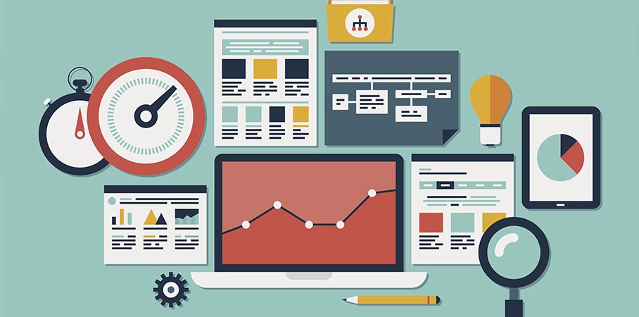
As we have mentioned before, there is no shortage of data on the energy system but how can we get a sense of how all the pieces fit together? Well the Energy System Database is a great place to start.
Database Categories
We have organized the data sets in number of ways to make it easier for you to find what you are looking for. The first way we have organized the data is by energy type. You can see data on:
- Primary energy – data by source such as oil & gas, coal, or renewables
- End-Use energy – how is that energy being used? By consumers? Industry? For transportation or export?
- Impacts of the energy sector – data on Greenhouse Gas (GHG) emissions, environmental and economic impacts of energy in Alberta
The second organization type is by data source type. Here you can look at data from:
- Government – both Provincial and Federal
- Industry – including industry associations
- Non-Governmental organizations
And finally, we have categorized the data sets by visualization type:
- Raw data – data tables that don’t have any visualization applied
- Reports – data visuals that have been pre-built by the report designer
- Interactive – visualizations that let you change variables and play with assumptions
In addition, we have tagged each item with a link to the visualization, the source data (if available), the format of the data, years the data is available and provided a screenshot preview of the data.
How the Database Works
Why did we make these choices for organizing all of these data sets? For three key reasons:
- People mean many things when they say “energy system”. Some are talking about electricity production, some are talking about oil & gas, some are talking about energy for export, some about energy efficiency. By collecting data sets on ALL of these views of the energy system, you get a sense of the overall picture of energy in Alberta.
- As mentioned before, data is always telling a story. And who tells that story will inevitably influence the kind of story being told. Looking at energy data from governments, industry and NGOs lets us compare and contrast and start to understand the stories behind the data.
- As much as we can give you our analysis of the data, you may want to decide for yourself. We have tried to give you links to as much of the raw data as is available so you can download and see for yourself. The Guardian in the UK (one of the world leaders in online data visualization) does this for almost all of their infographics and reports.
Next time, we’ll dig into a few of these visualizations to look behind the scenes at how the data was put together, look at the stories behind the data and what the visualizations can (and can’t!) tell us.
Contribute to the Database
Have you found a site that does an amazing job of visualizing this data? Know of a data set we should include? Please send a note to info@energyfutureslab.com and let us know. We’ll get it up on our site as soon as we can.

Steve Williams is a technology strategist designing and facilitating participant-driven public engagement events with over 20 years experience in the software industry
