
Image source: Student Energy
Stay tuned for the official launch of the Energy System Visualization site in mid-January!
Hi there,
I’m Steve Williams and I am an Information Designer for the Energy Futures Lab. I’m working on how the EFL uses data – how we can use existing data for decision making, how we can visualize and make sense of the data we have, and how we can develop new data and insights into Alberta’s energy system.
There is a significant amount of information about the Alberta energy system online, in databases, in academic journals, on government websites and on corporate pages. Despite efforts to collect data on everything from oils sands extraction rates to air quality measurements, more data doesn’t necessarily lead to better decisions. Decision makers, whether they be in policy or business, need strong and objective analyses to underpin conversations about such a complex, interconnected subject like energy transition.
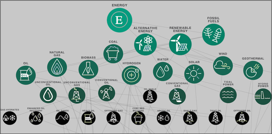
So what do we mean when we talk about visualizing data? Data visualization can be everything from simple charts and graphs, to infographics (illustrating numbers in a highly visual format) to system maps (showing the relationship between parts of a system), simulations and interactive games that let us test future choices and directions.
So why is the Energy Futures Lab so interested in looking at data in these ways? Here are our top 3 reasons:
- Visualizations give Fellows the ability to test theories and rapidly prototype ideas. Our energy system is big and complex. Testing new ideas and innovations in the “real world” can take a long time and be very expensive. Simulating different ideas and scenarios with data can help narrow in on promising policy or technical innovations.
- Simulations can expose assumptions and instead allow conversations informed by objective data. We all are susceptible to confirmation bias (retaining information that confirms our beliefs and ignoring opposing views). Sometimes, we need to be reminded of alternative views. Visualizing let’s us see the bigger picture and make decisions that go beyond a single element.
- No single number or chart exists in a vacuum – they tell a story, they are part of a narrative. Understanding the stories the data tells us, and how that relates to narratives of energy in Alberta, gives us insight into potential innovation areas or market opportunities.
While there is a massive amount of data out there, it is fragmented and disconnected which makes it hard to see the whole system. No one seems to have an overall view of how the Alberta energy system works as a whole. We need to take an interdisciplinary approach to understanding, measuring and balancing the economic, environmental, technical and policy components of our energy system.
There is a great benefit to bringing this information together in one place – organized, categorized and linked. That’s where the upcoming Energy System Visualization site comes in!
We are bringing together 40 different visual representations of the Alberta energy system and categorizing this data by energy source type, level of interactivity and more. We’ll be following up with new data sets and visualizations and analysis each month.
The Energy System Visualization site will give both our Energy Futures Lab Fellows and Canadians alike the knowledge they need to make informed contributions to the energy system transition. Stay tuned for the official launch of the Energy System Visualization site in mid-January!

Steve Williams is a technology strategist designing and facilitating participant-driven public engagement events with over 20 years experience in the software industry
